A Livelier Approach for a Wholesome Brand
Pokémon is one of the largest franchises in the world, bringing joy to countless fans throughout its nearly 30-year history. Our design approach embodies that same sense of joy and wholesomeness.
Having followed the franchise myself since I was a kid (Johto will forever be my favorite region), injecting that fandom and knowledge into these products elevates overall brand messaging.
Creating Excitement
The product design process in this space is influenced by a structured style guide from the licensor. Our goal is to create products that create excitement within the Pokémon fanbase, while simultaneously sticking to these design rules.
Though the product lines themselves use similar footprints and bases, designing with different production techniques add a uniqueness to the product line, giving consumers details to enjoy. We accomplish this with various executions, such as UV printing, emboss/deboss, foil applications, etc.
An Updated Look
What is the Pokémon identity, if not the Pokémon themselves?
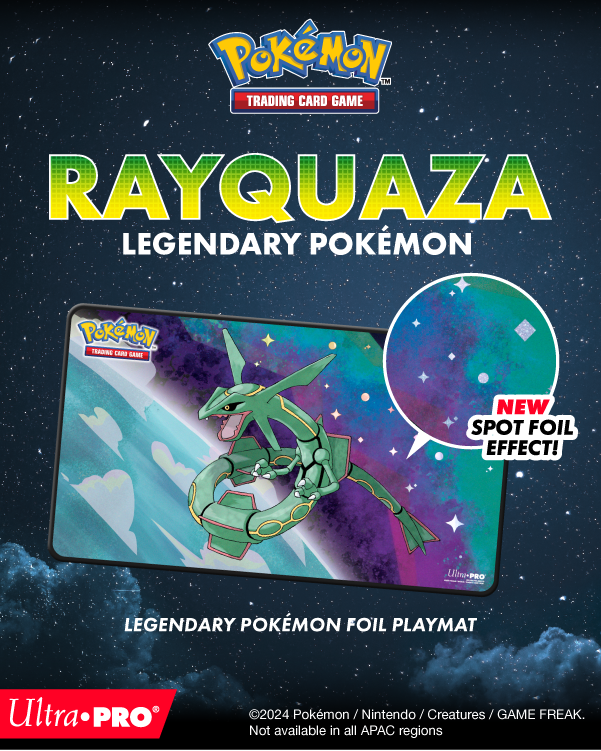
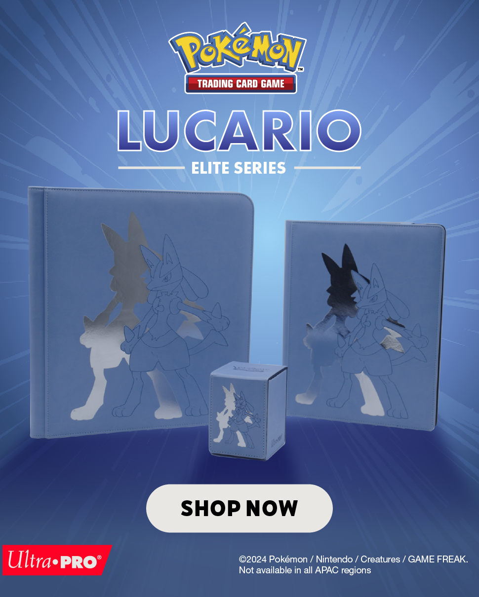
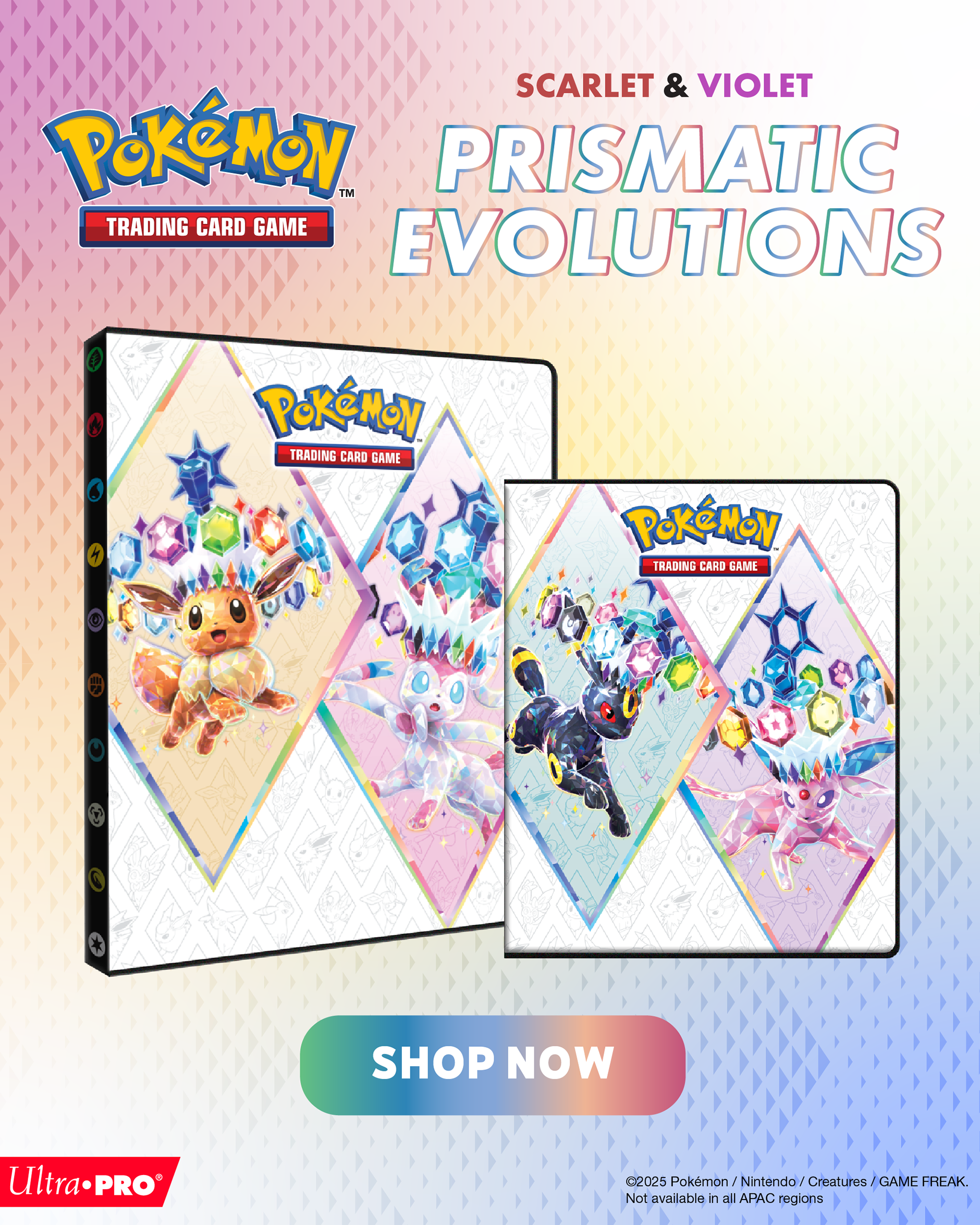
We have updated the marketing assets from from hyper product-focused to more brand + identity-focused. Previously, on web and social channels, the way the product line was presented often came down to messy product collages with no unifying theme.
While we continue to focus on the product as the hero of our marketing campaigns, this newfound brand look creates a more cohesive feel. We start with the Pokémon's identity, lean on their traits and lore, and connect each marketing campaign with bright color pops, fun tie-in's, and 'gamer-core' music choices.
Packaging Update
Similar to how we are treating the product line itself, the choices we are making in packaging are creating a more harmonious brand identity. This is being done through more intentional use of an updated Ultra PRO style guide, which you can learn more about here.
The second phase of this refresh is something I am personally excited about. While the first phase is solidifying the Ultra PRO style guide in packaging, the upcoming phase will start to lean on the same ideology from the marketing assets -- by giving more focus to the Pokémon. You can start seeing this take shape in the Rayquaza Foil Playmat box.
As we move further into specialized packaging, the excitement for these products will keep evolving!


Shoutouts: Nolan Englund (Video) • Ken Pilapil, Jaime Lee, Xavier Russell (Design) • Daniel Zayas, Justin Cole (Product Management)
Artwork featured is the property of their respective owners. No copyright infringement is intended, and all rights are reserved by the original creators.
