A Brand Refresh in the Making
Ultra PRO is the standard of safe protection -- it is the one of the oldest names in gaming and sports collectibles, and has established itself as an industry leader.
You Collect. We Protect.
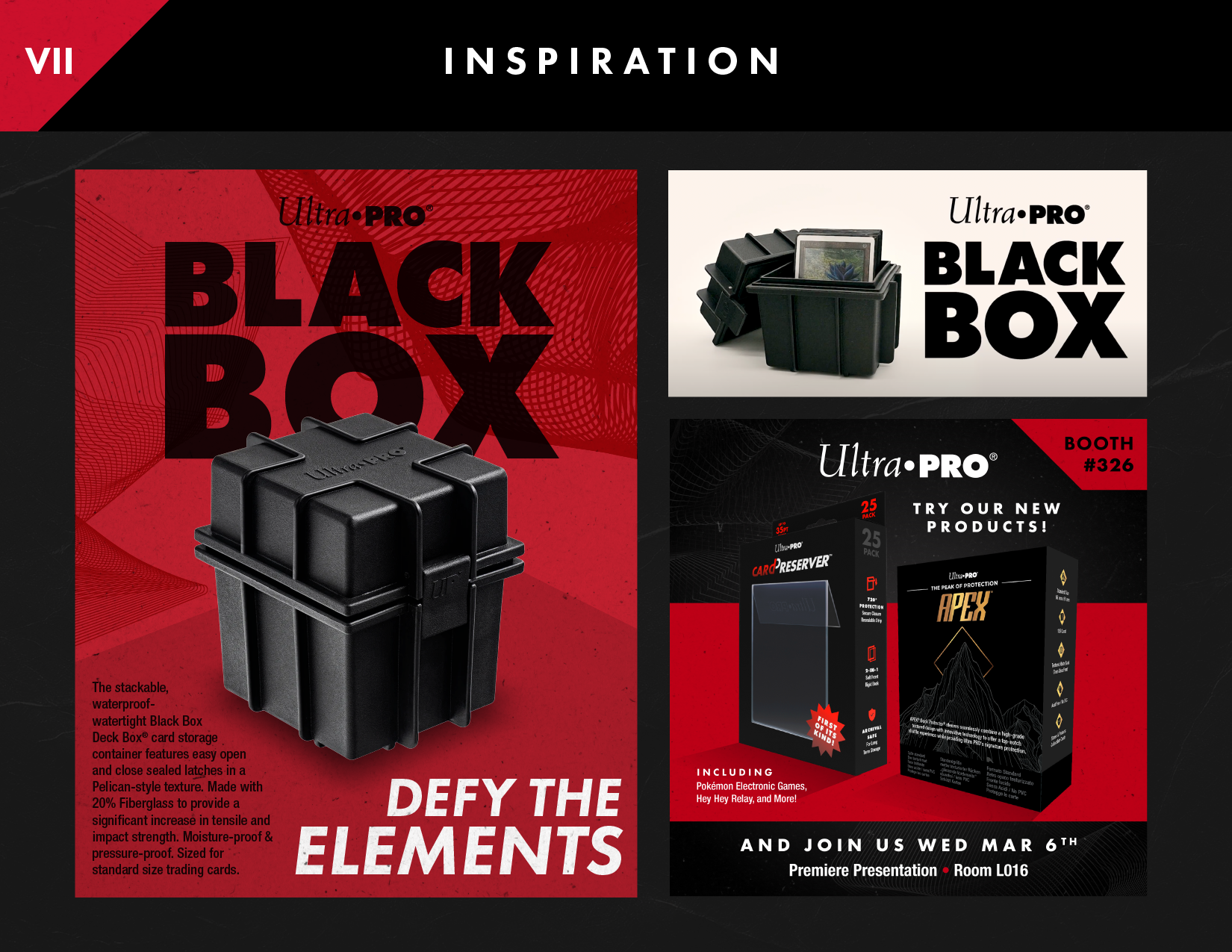
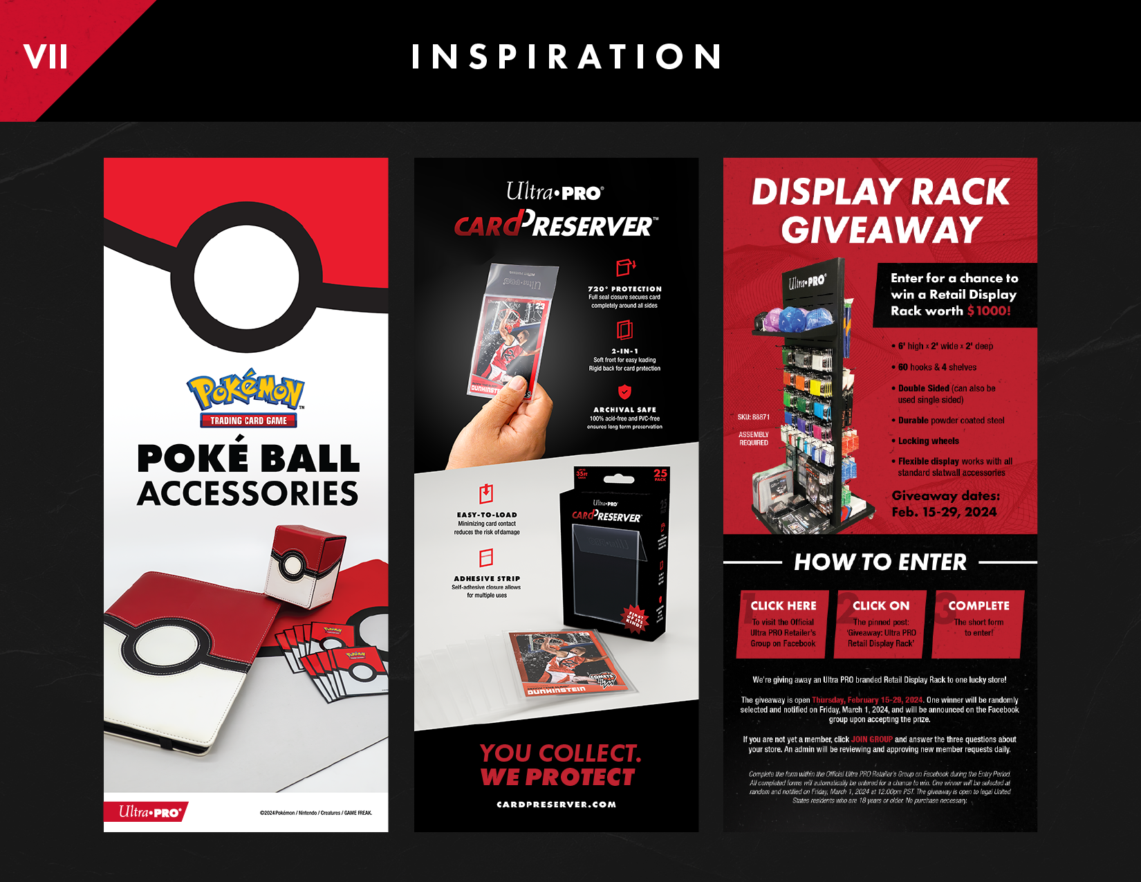
We are handling Ultra PRO's brand refresh in multiple phases. The first involves an overhaul of the current design formula. Digging into the brand's history, we see that the brand's core has slightly diverged itself from its many identities (in sports, gaming, entertainment, and its license partners). The key goal for this first phase is to bring it all back through thoughtful design.
In its history, the colors red and black have proven to be colors that represent Ultra PRO, but they were never claimed as true color identities of the brand. Setting up a clearer brand guide that lean on this duo forms cohesive design that can be felt through all messaging.
Additionally, instituting Futura as the primary font face for the brand creates more forward-looking design momentum, while also harking back to the word mark (as it has, and always will be, the PRO in Ultra PRO)
The Next Step
The second phase of this refresh is an update to the logo mark, which is still in its execution phases. Check back soon for this exciting update!


Shoutouts: Nolan Englund (Video) • Ken Pilapil, Jaime Lee, Xavier Russell (Design)
